About the Project...
This logo was commissioned by NAWIC North Central Region for their spring forum.
The theme for 2026 is "Building in Balance: Empowered to Grow", a play on the national park that surrounds the conference's event space. My goal was to create a logo for their event to be placed on promotional material, event banners, sponsorship forms, and other event related materials.
A Peek at the Process...
This design came to life through several rounds of sketches, each tweaked in response to client feedback.
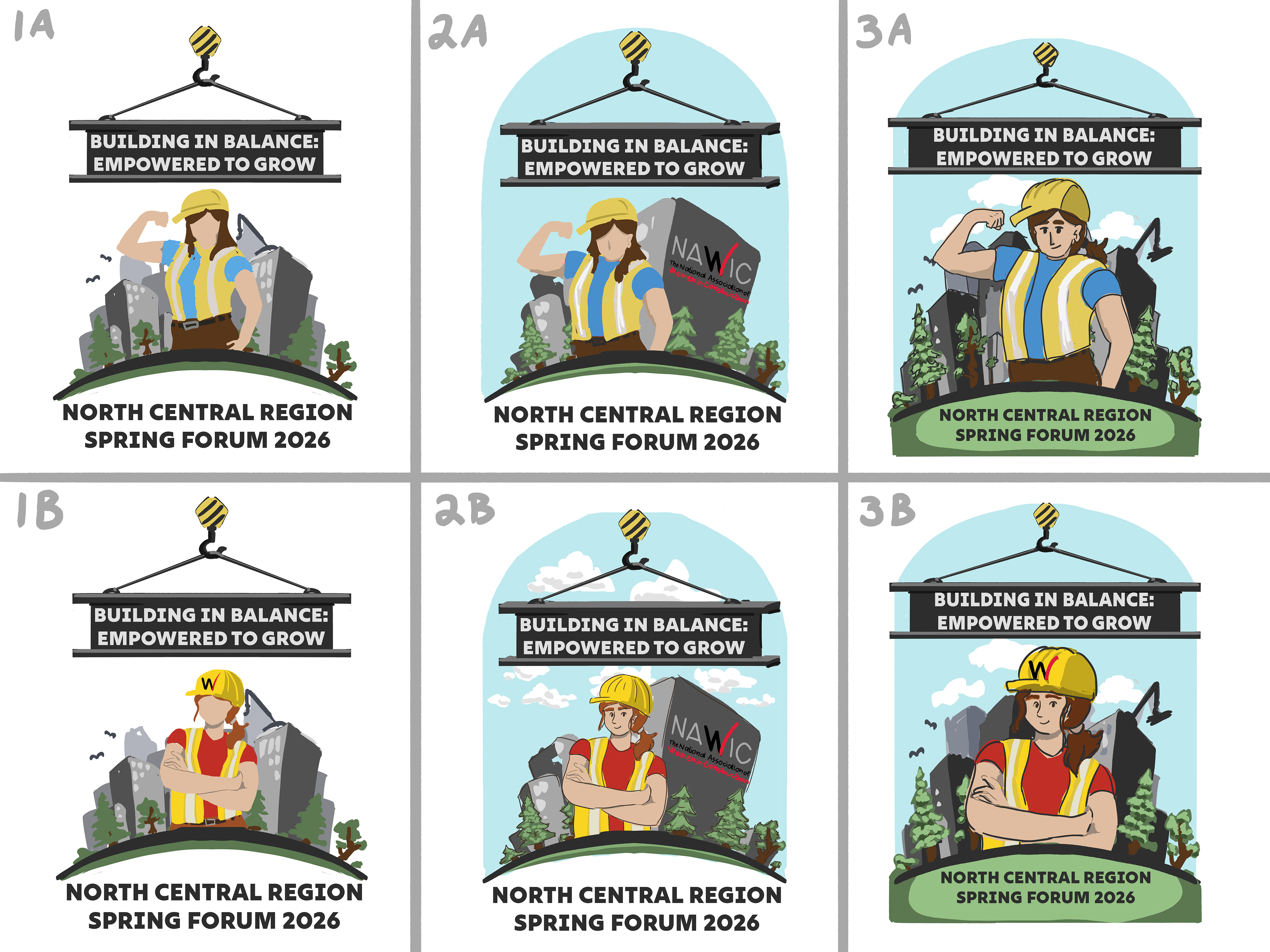
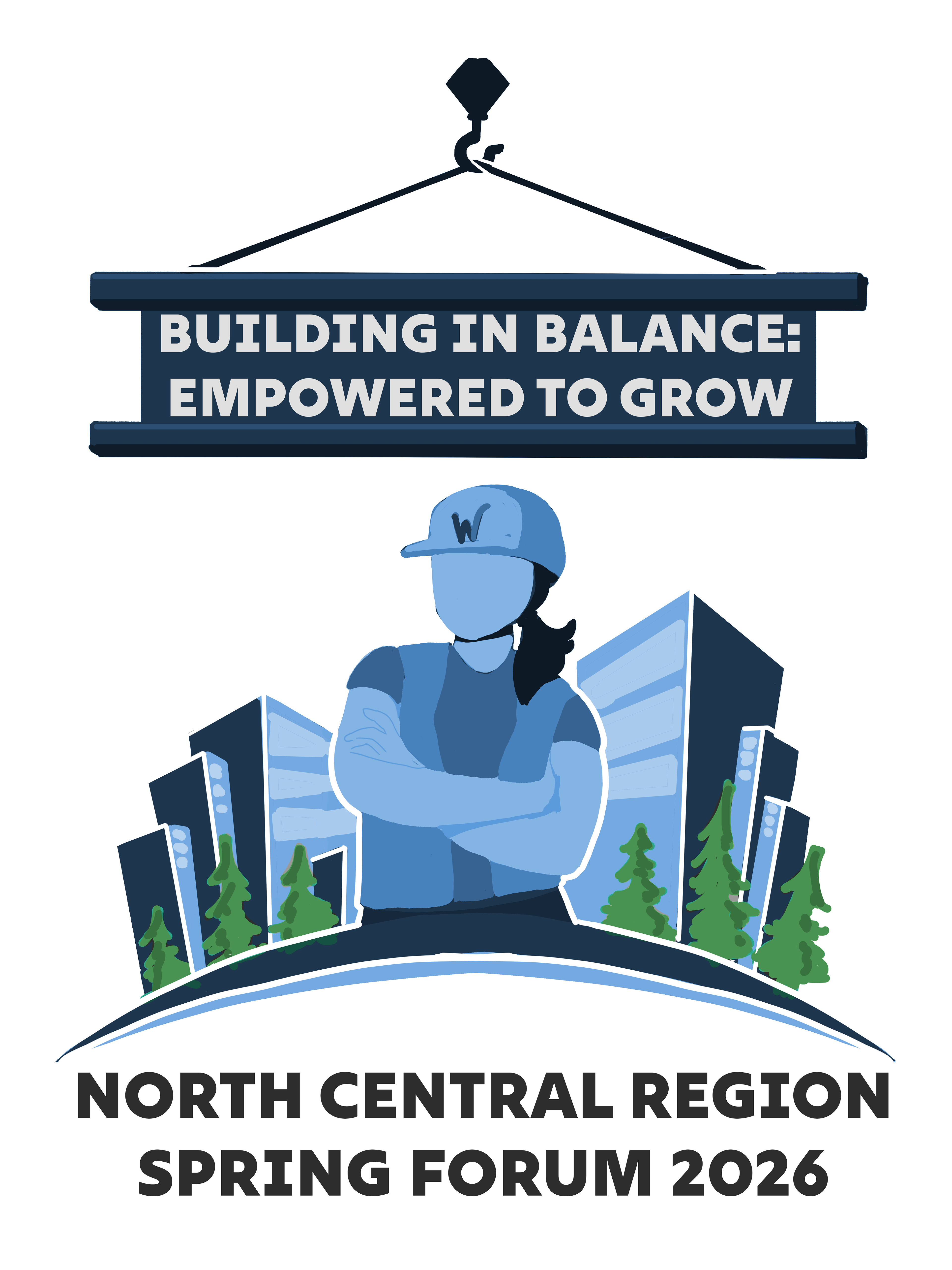
This project started out with six different rough sketches, featuring variations in pose, detail, and color.
Loose and rough in design, these sketches experiment with line versus lineless art styles. Some incorporate more background elements and details than others.
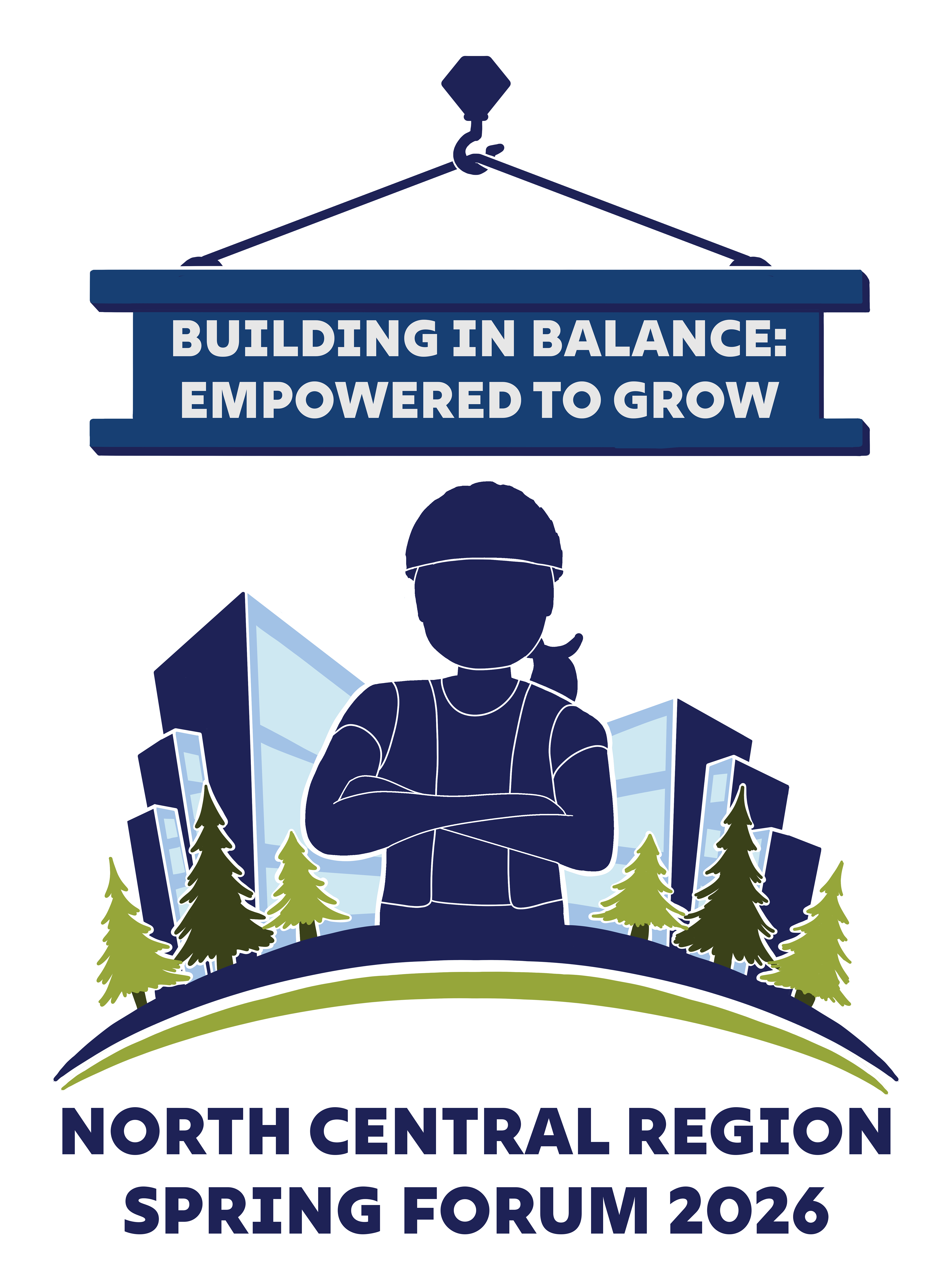
We decided to go another round of sketches with a slightly more refined and minimalistic approach, toning down the cartoon aesthetic and leaning more toward a refined, simplistic design. Elements from a few different sketches were composited together.

These two sketches narrow down the overall design. The lineless style with arms crossed pose worked best for this project. Colors were simplified to get a better composition, and a white border around the person was added to help visually separate the foreground from the background buildings.

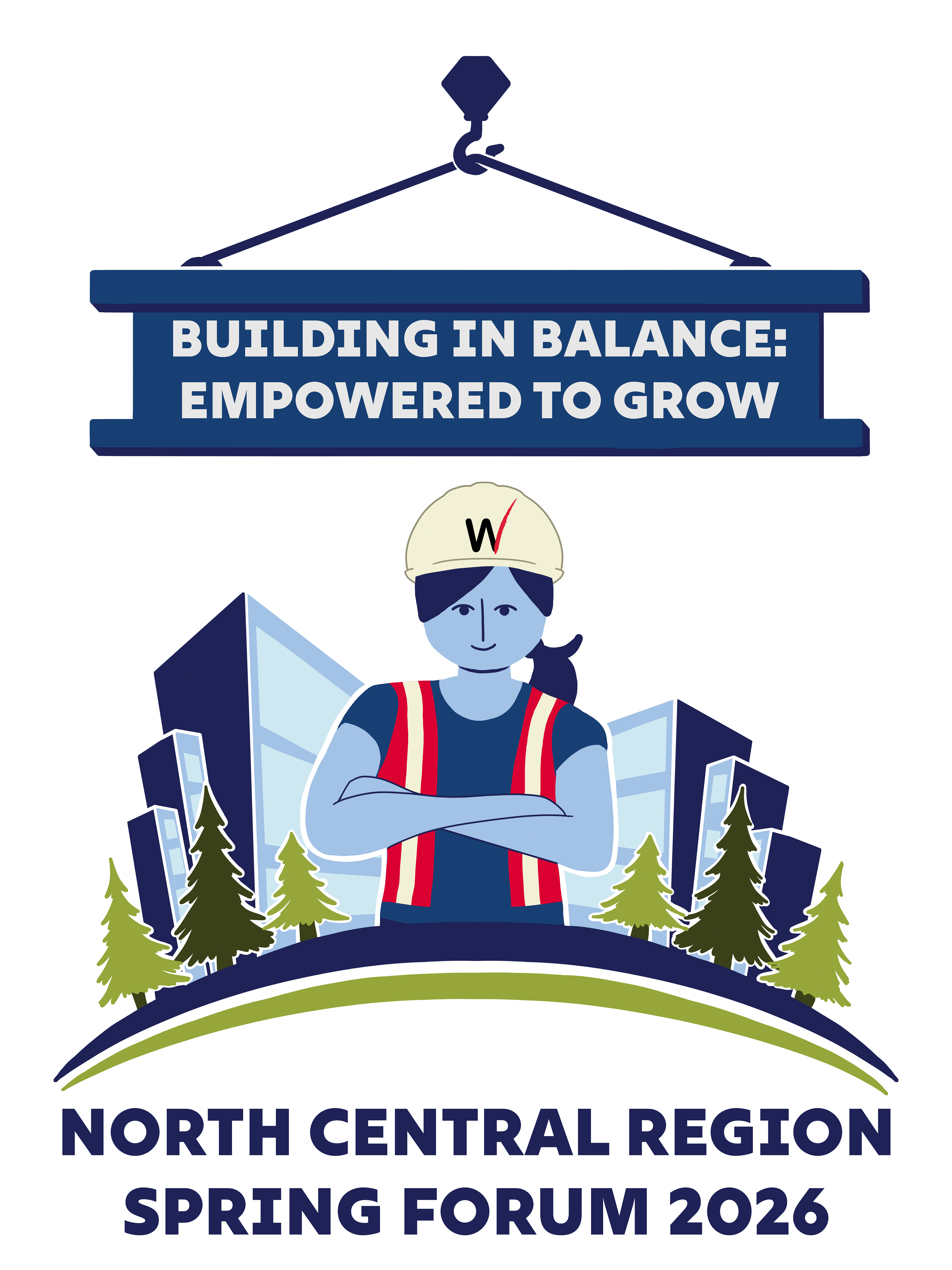
With the overall layout tied down, this round of designs was cleaned up, and NAWIC’s logo and colors were reincorporated into the design. The overall aesthetic shifted toward rounder, more simplified shapes, and vibrancy was added to the colors.
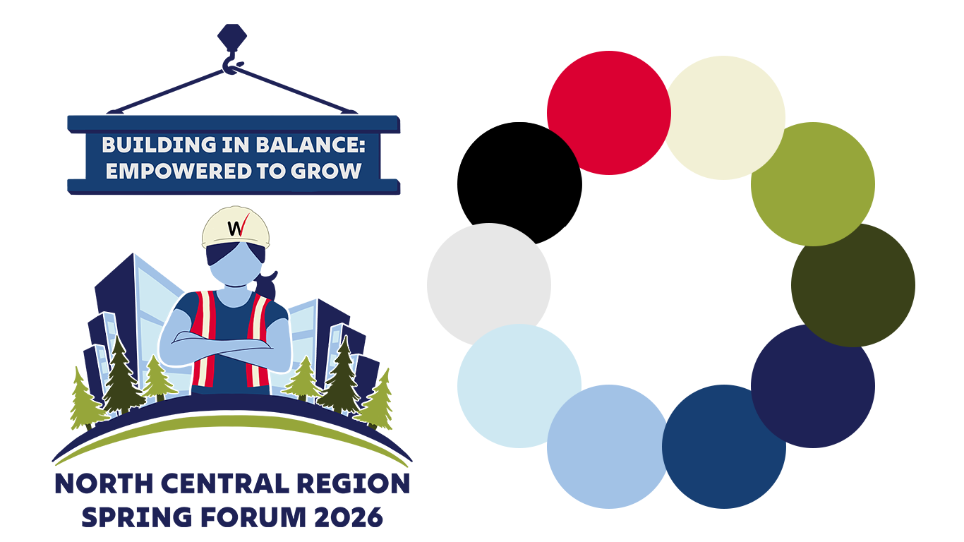
The final design features NAWIC's iconic red and black "W" logo with a blend of both minimalism and pop art aesthetics. It is colorful, recognizable, and eye-catching.